

before
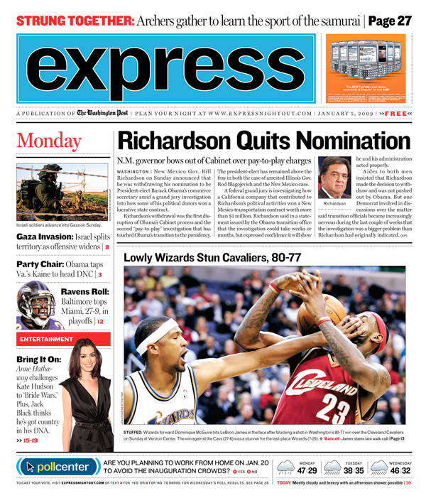
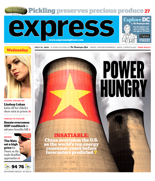
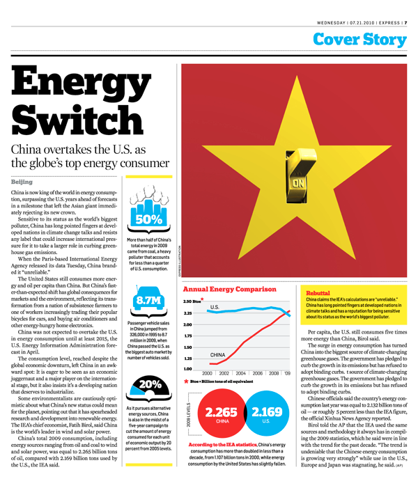
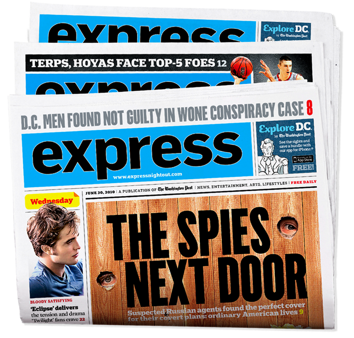
Cover Redesign: The former front page presentation never felt quite right. By presenting a fully contained story in a small space on Page One, the most important news of the day had a smaller word count than lead stories inside. We replaced the Page One story with a bold and prominent billboard/poster front that teased to a full page cover story inside the paper, providing a comprehensive and lively presentation of the day’s top story.
before
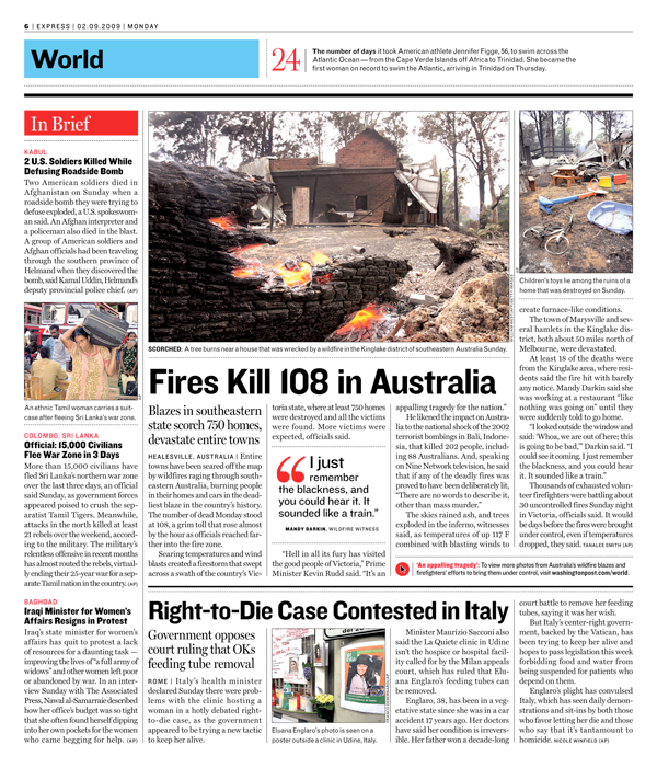
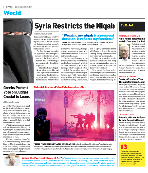
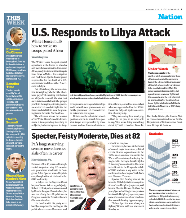
News Pages: We revamped news page presentation by adding bolder color, infographics and standalone elements that presented news items in non-traditional storyforms. Smaller visual elements such as fact boxes and quotes were inset in longer stories to increase entry-points and help capture readers’ interest.
before
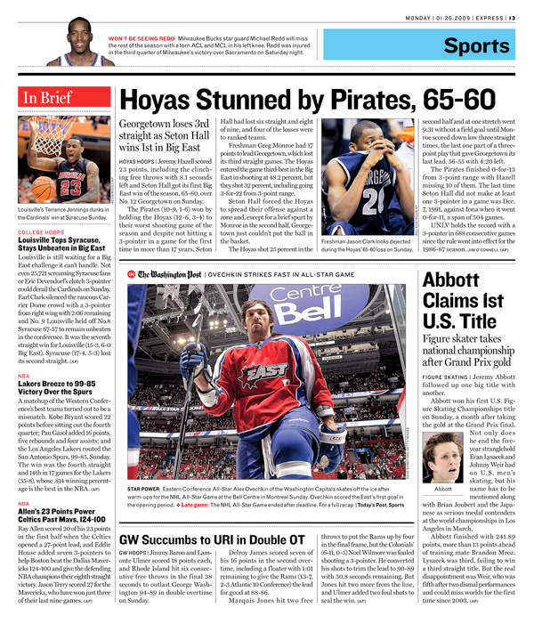
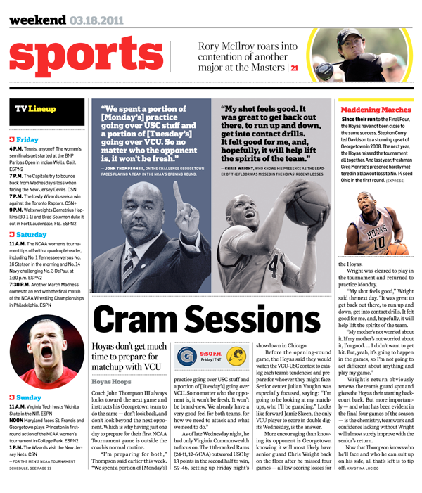
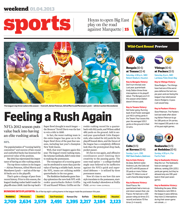
Sports Pages: The Express sports section underwent an editorial shift away from a reliance on wire copy toward self-produced content that lent itself to a much more energetic visual presentation. Traditional story-and-news-photo presentation was energized with photo illustration and smaller “chunked up” elements that brought more lively and locally focused information to readers.
before
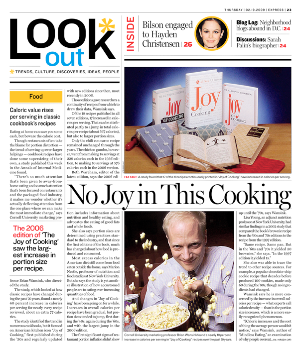
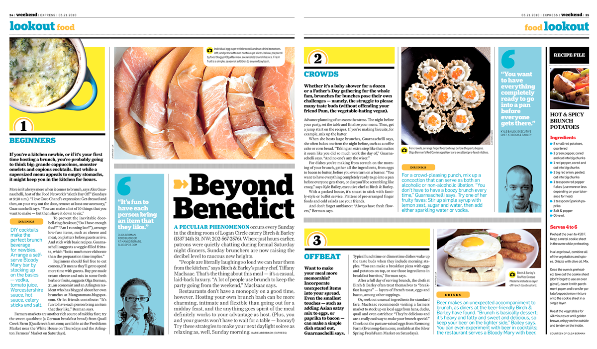
Feature Pages: We revamped Express’ “Lookout” feature pages by replacing long-form wire stories with well-planned self-written and self-photographed features with a local angle. The presentation of lead feature stories was livened up with brighter and bolder design elements akin to a magazine approach and a greater focus was placed on in-studio and on-site photography.
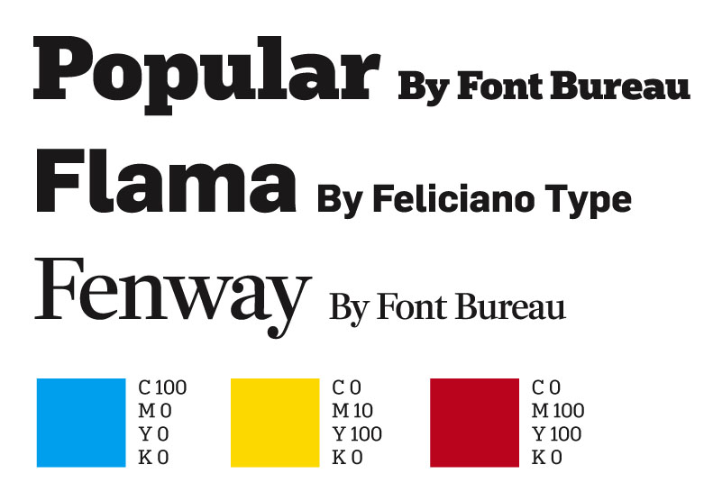
We stayed true to the familiar design of Express by opting to refresh typography, color and grids rather than overhaul them. A more versatile sans serif family was found in Felciano Type’s Flama, Font Bureau’s Fenway contemporized Express’ serif type and the slab typeface Popular, also from Font Bureau, vitalized display type. We kept the paper’s primary color palette but loosened up restrictions on new color for sports and feature design.