
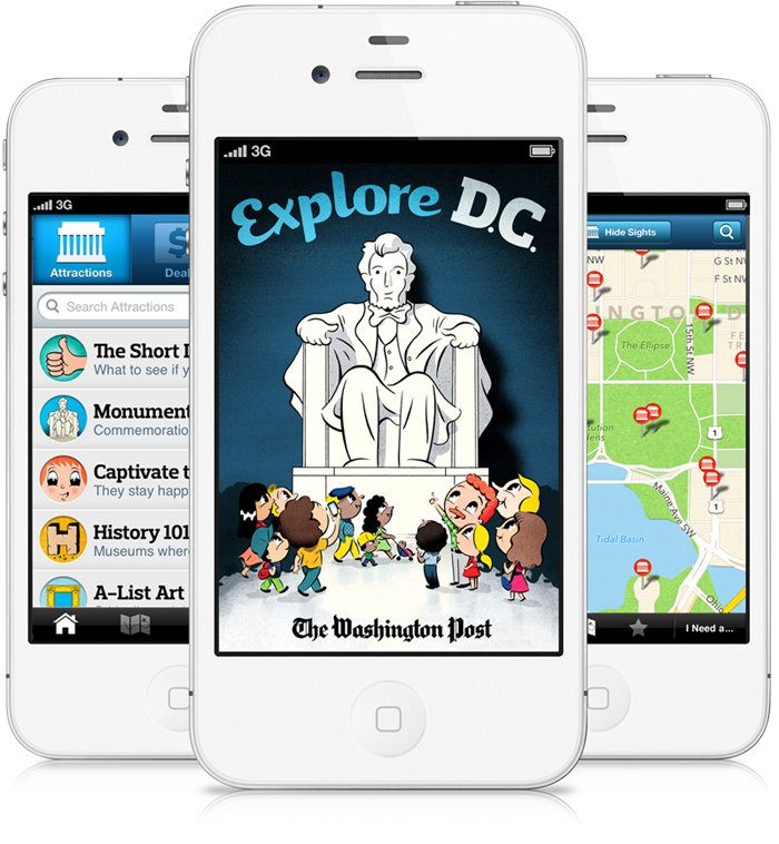


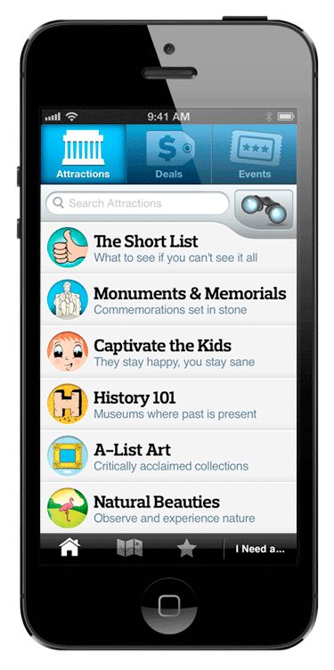
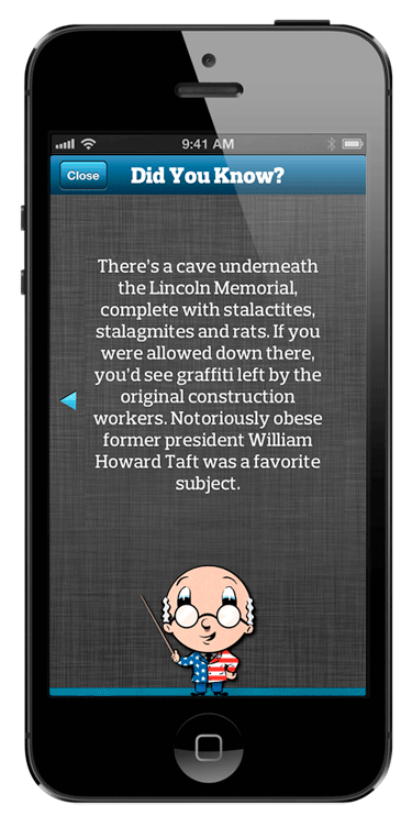
The user experience was built around thoughtfully curated content. We sought to avoid the pitfall of other travel apps that serve up a giant list of things to do and see for the user to blindly comb through. Explore D.C. presents attractions within categories that reflect the city’s unique offerings and appeal to the interests of its tourists.
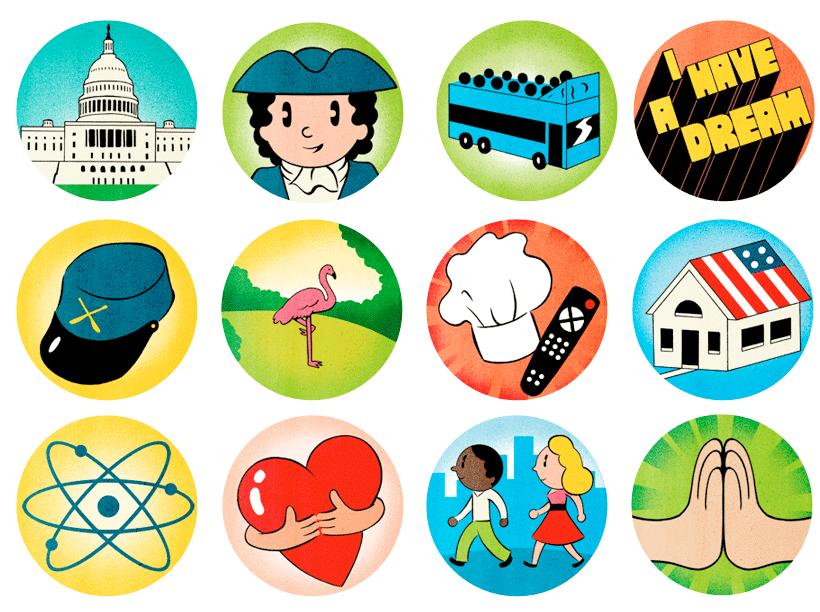
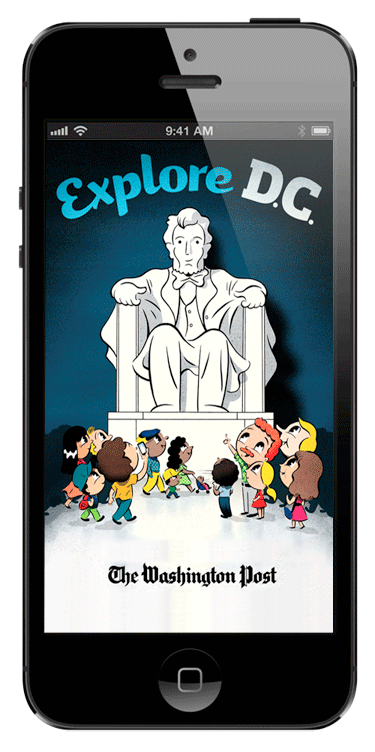
For Explore D.C.’s visual identity, we took a print design approach by relying on illustration and unique typography to set just the right personality: a friendly and cute look and feel that would appeal to all ages. The illustration by Ryan Snook is sweet but not saccharine, and the use of the Prelo font family sets a strong screen-to-screen typographic identity.
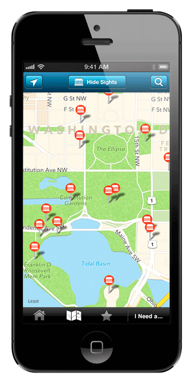
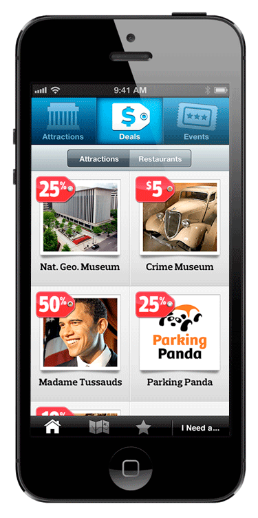
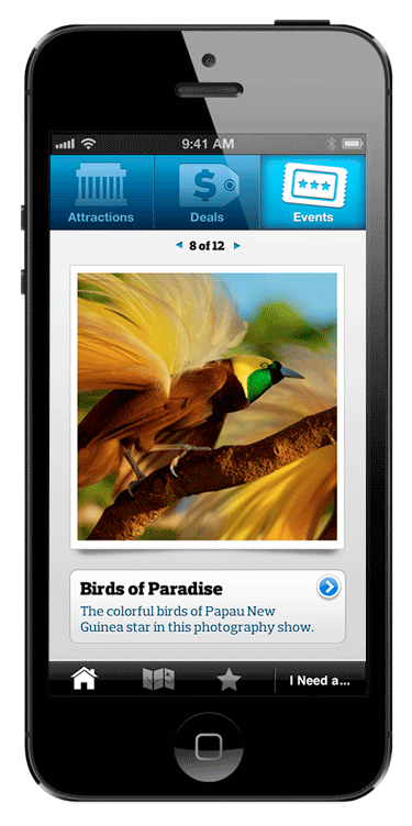
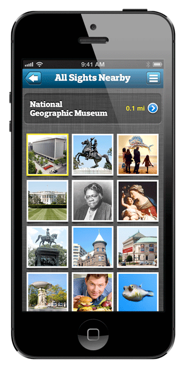
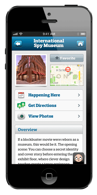
The app is as useful as it is interesting to read through. Utilities include a map that plots all of the sights and gives step-by-step directions, GPS-activated deals at top tourist attractions, a photo deck showing tourist-centric events, a photo-driven view of all nearby sights, and a quickly accessible “I Need A …” list of places tourists might need to find in a hurry.
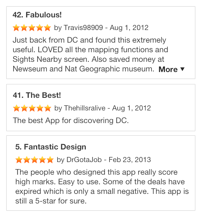
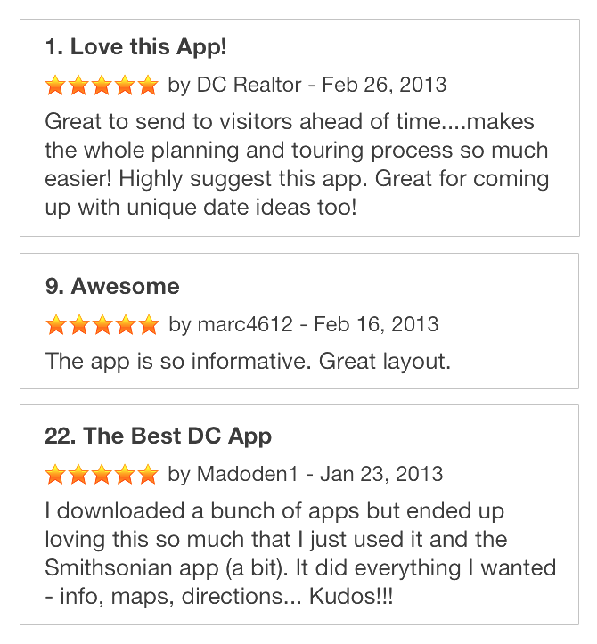
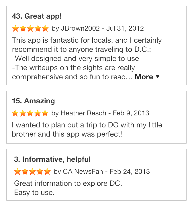
Reviews have been highly positive since launch, pointing to the intuitive experience, clean UI design, wealth of useful content and smooth mapping and directions functionality.
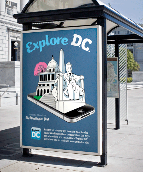
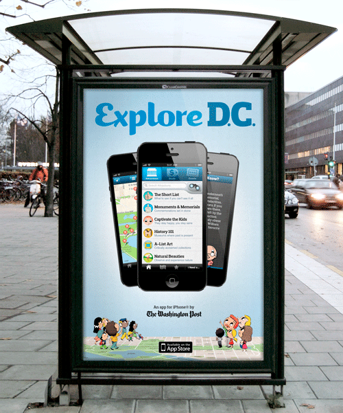
We designed an ad campaign to introduce Explore D.C., again enlisting Ryan Snook to illustrate tourists and monuments for ads of all shapes and sizes.